


Interior design is not just about creating a beautiful room; it’s about creating an experience for all five senses that work together to produce a desired feeling for all who enter. No matter the room or style, these classic design principles serve as a guide to achieve the experience you’re seeking.
Corey Low lives on the East Side with her family. Learn more at CoreyLowInteriors.com
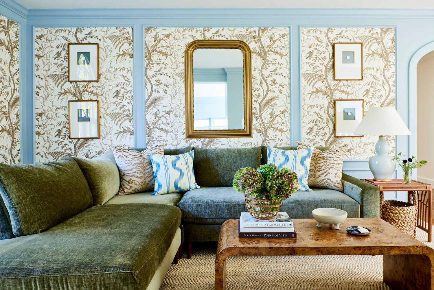
Emphasis: This is established by outlining a focal point for the room, somewhere your eye is immediately drawn to upon entry. In a bedroom, it’s usually a bed; in an office, it’s the desk; and in the living room, the fireplace. The focal point should lift both your eyes and your countenance. For example, if your eye is naturally drawn to the bed when you walk into a bedroom, a nice canopy bed frame or mirror above the headboard would help to draw your eyes up and make the room feel larger.
Balance: If you were to cut your room in half, there should be just as much visual weight on one side as the other. This can be achieved via symmetry, or without it. For example, you may have a living room seating arrangement with a sofa and a chair on either side of it. The two chairs provide symmetry and the living room feels balanced. In another, asymmetrical setting, you could have a coffee table on one side of a sofa, and two chairs on the other. The layout is not symmetrical, but the furniture on both sides of the coffee table feels even.
Proportion and Scale: This principle focuses on the size of an element in relation to the space as a whole. If you put a king bed in an 8’x10’ room, it will overwhelm the space. Furniture, accessories, and rugs should all be appropriately sized relative to one another and the overall environment. One quick and easy rule of thumb is the 2:3 ratio. If you’re looking to hang artwork above a sofa, a mirror above an entry table, or a TV above a mantle, they should all be about two-thirds the width of the item they’re mounted above.
Harmony: This is a fancy way of saying that things need to go together. It can be applied to many things, but color is the most important and applicable element. The most harmonious color combinations come from complementary colors, or those on opposite sides of the color wheel, and tonal colors, or tones of the same hue.
Contrast: Where harmony asks that parts of a room are intentionally alike, contrast demands that other things decidedly stand against each other. This can come from color (black and white) or textures (such as a smooth, shiny glass coffee table topped with a woven wood tray). Rooms that lack contrast will feel one-dimensional and flat.


Comments
No comments on this item Please log in to comment by clicking here